Overview.
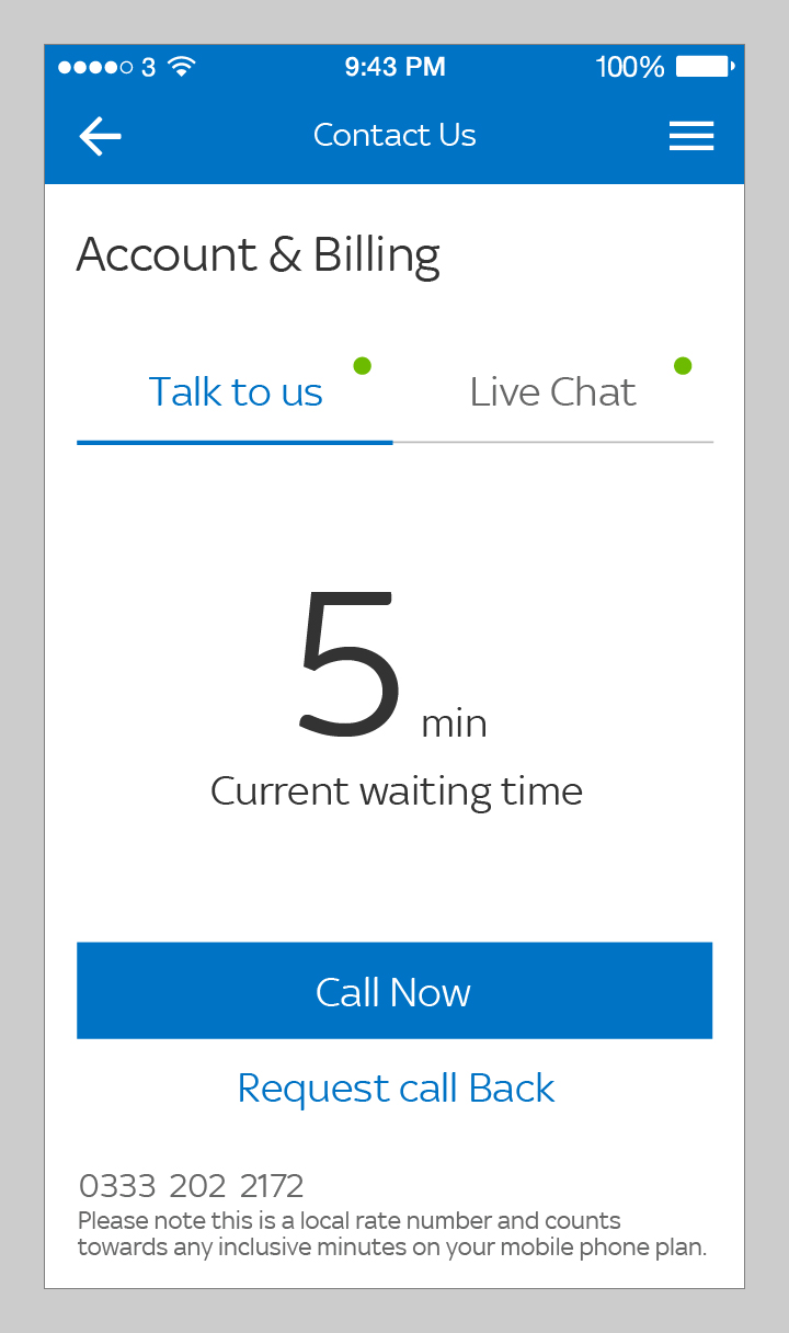
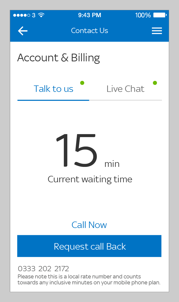
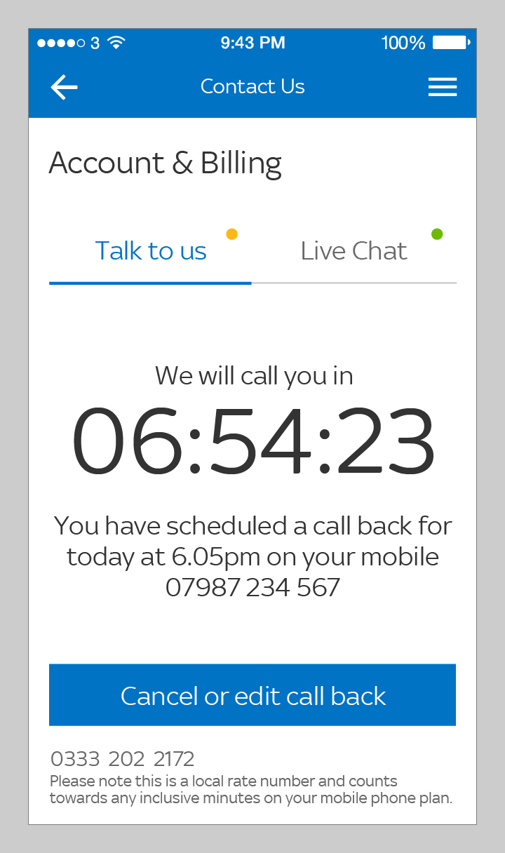
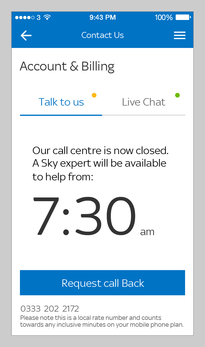
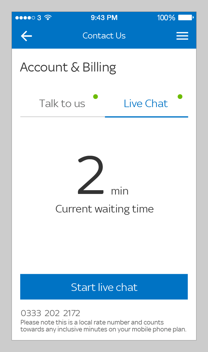
Contact Us.
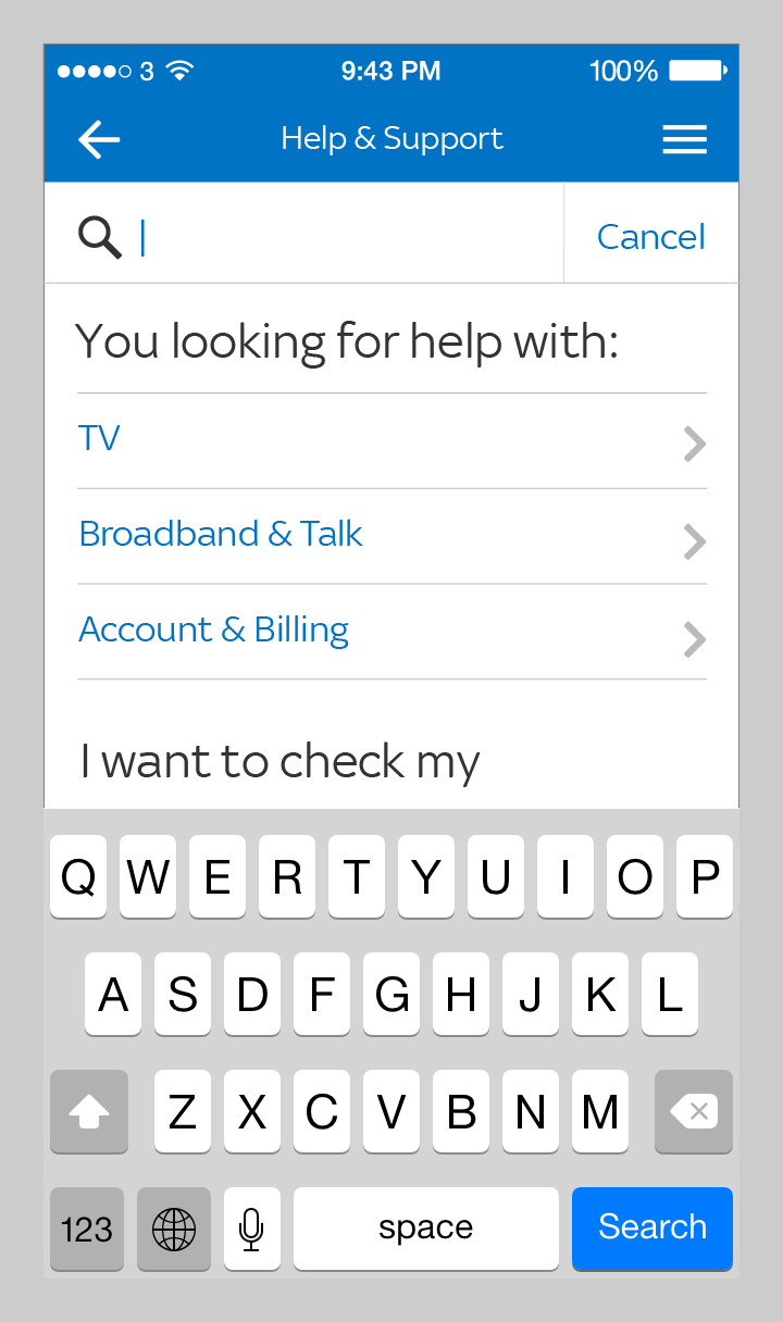
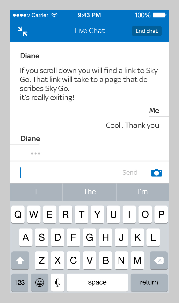
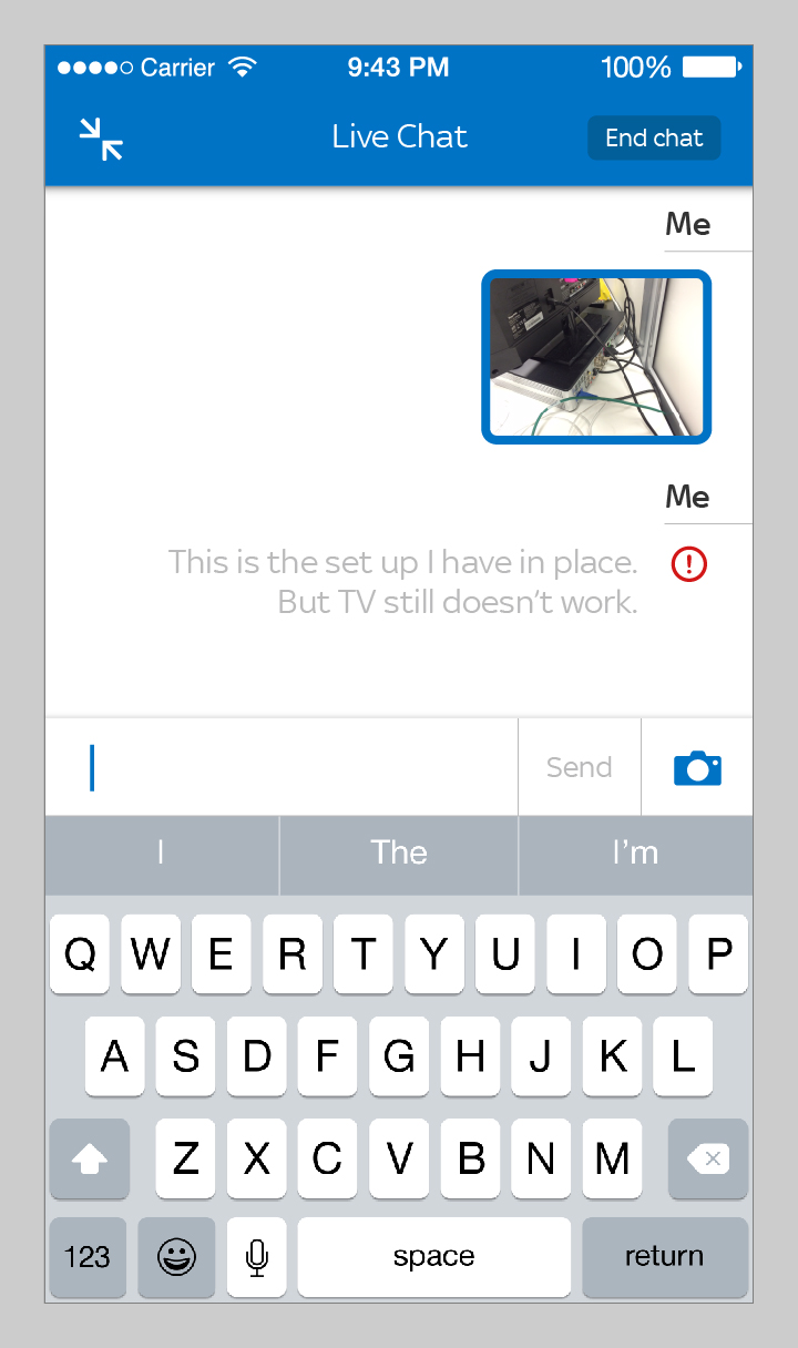
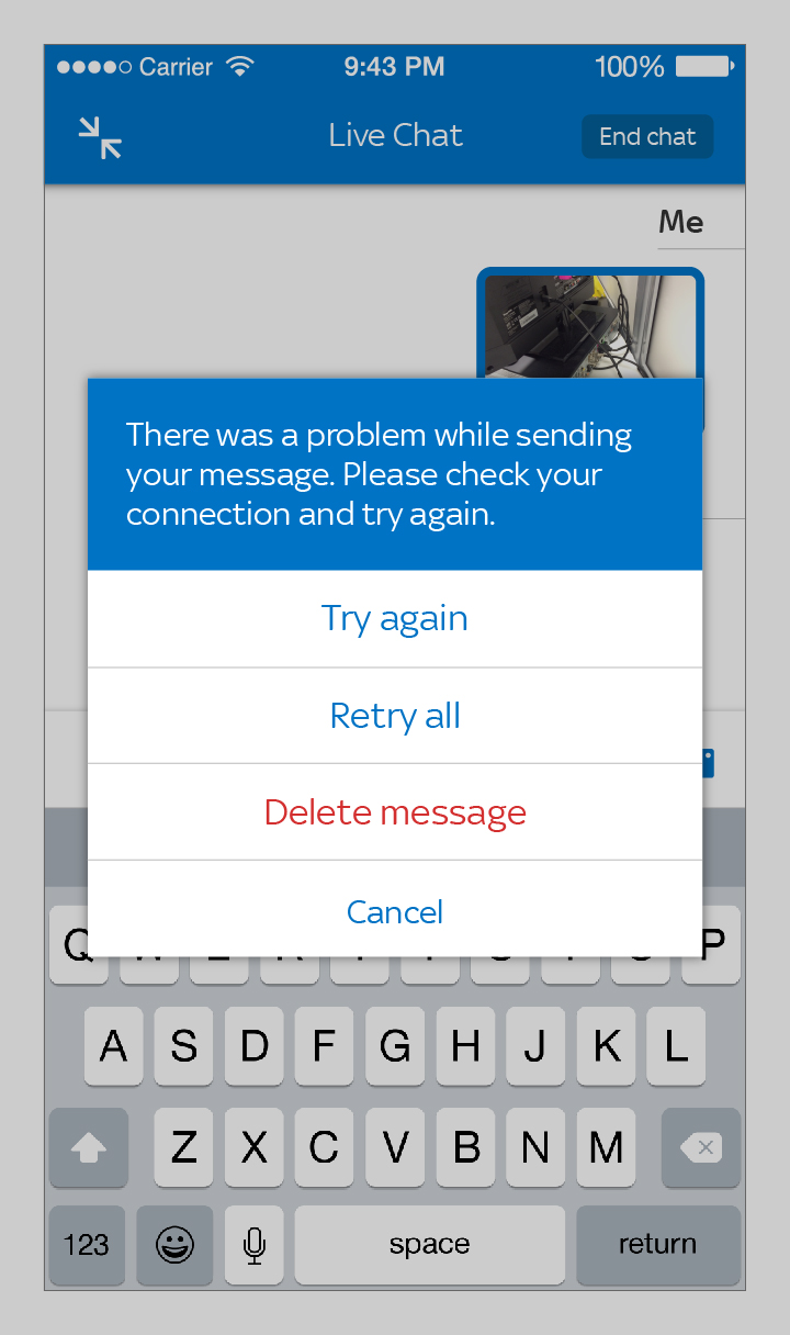
Live Chat.


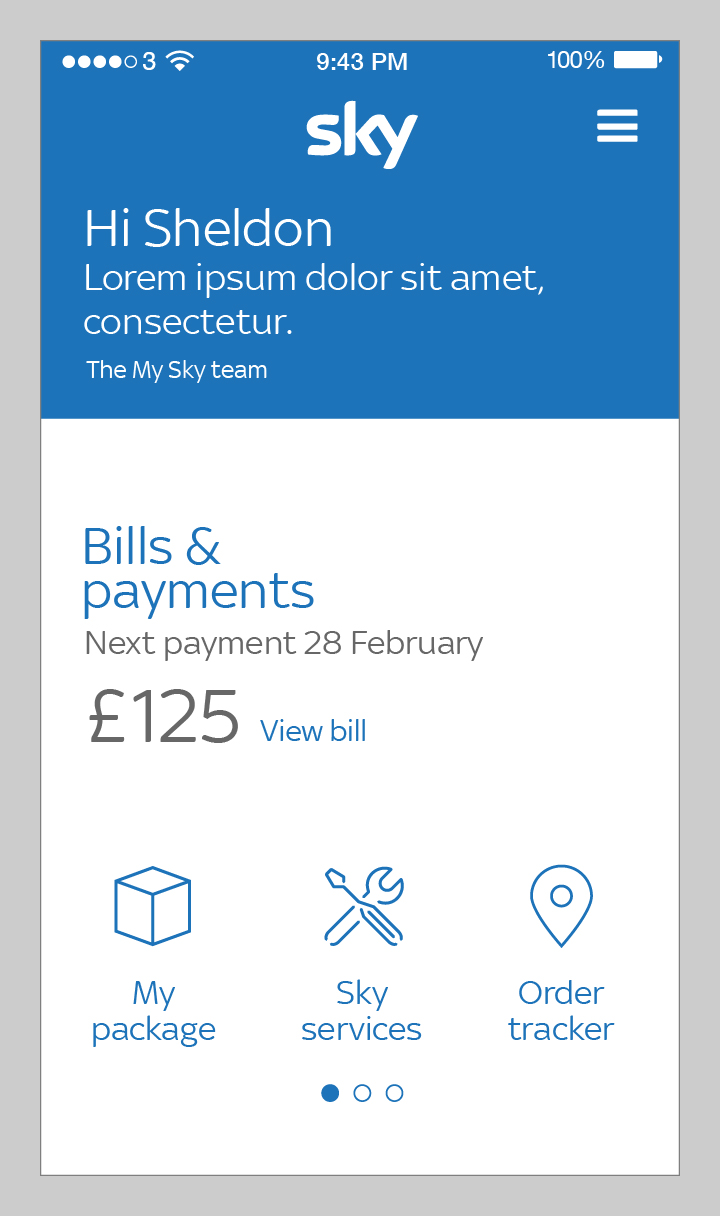
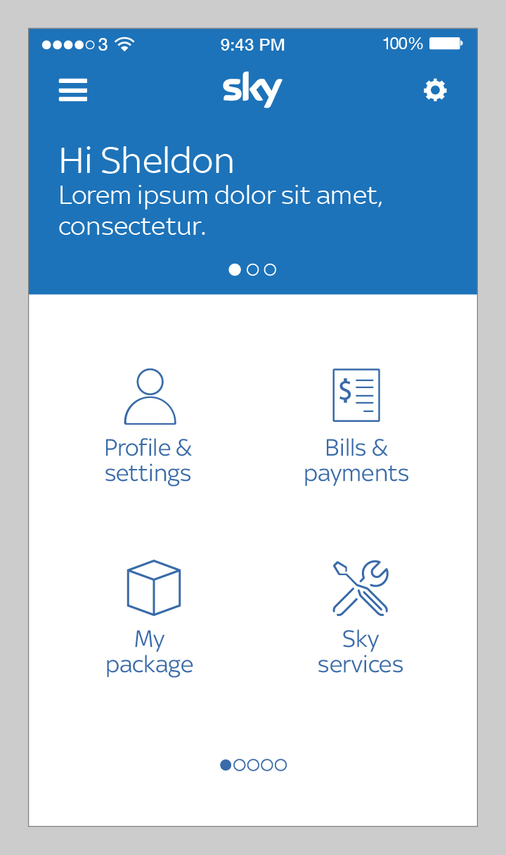
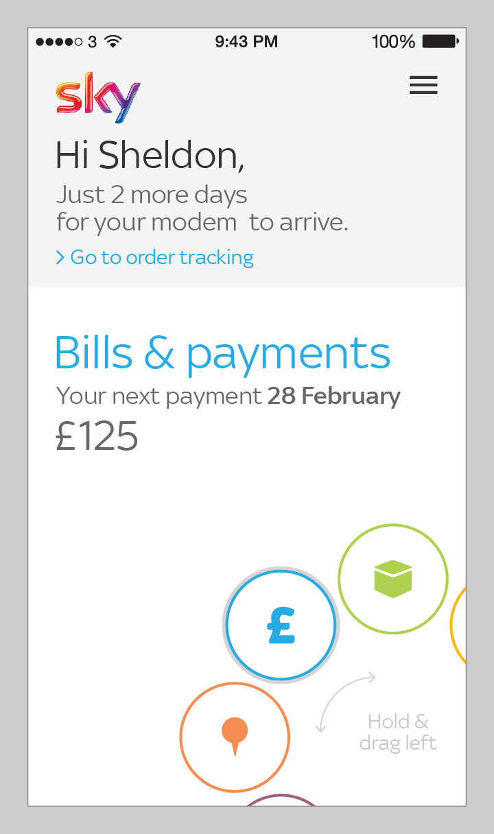
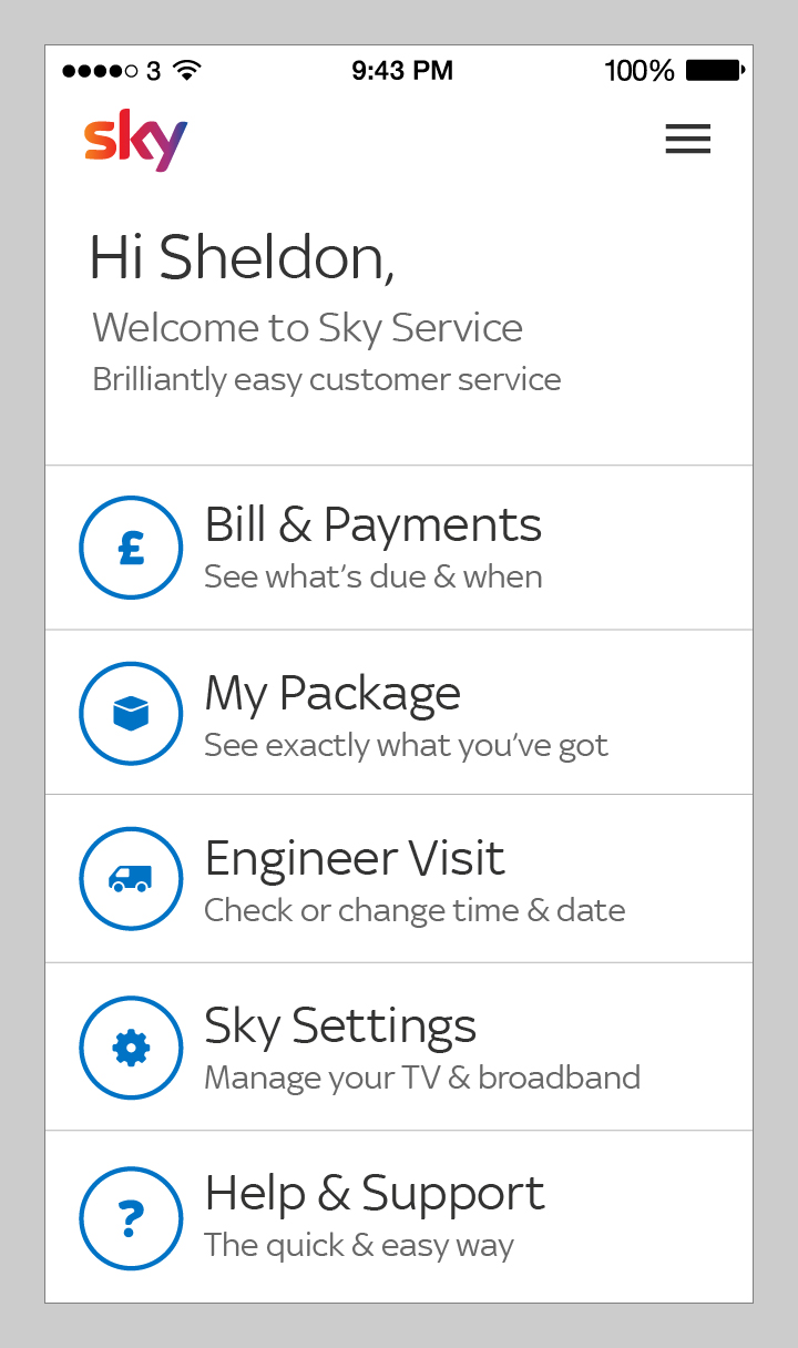
Concept phase.
Here I’m sparing you the pain of millions of badly done drawings and quick Illustrator experimentations. During the concept phase we had to come up with various concepts to engage our stakeholders and raise support for the business case. It was playtime, time to explore – but as the goal was to engage the business and time was limited we had to keep our feet on the ground.