Sky.com
A Responsive window into Sky’s world.
Concept – UI Design

Project.
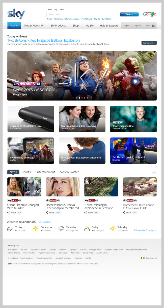
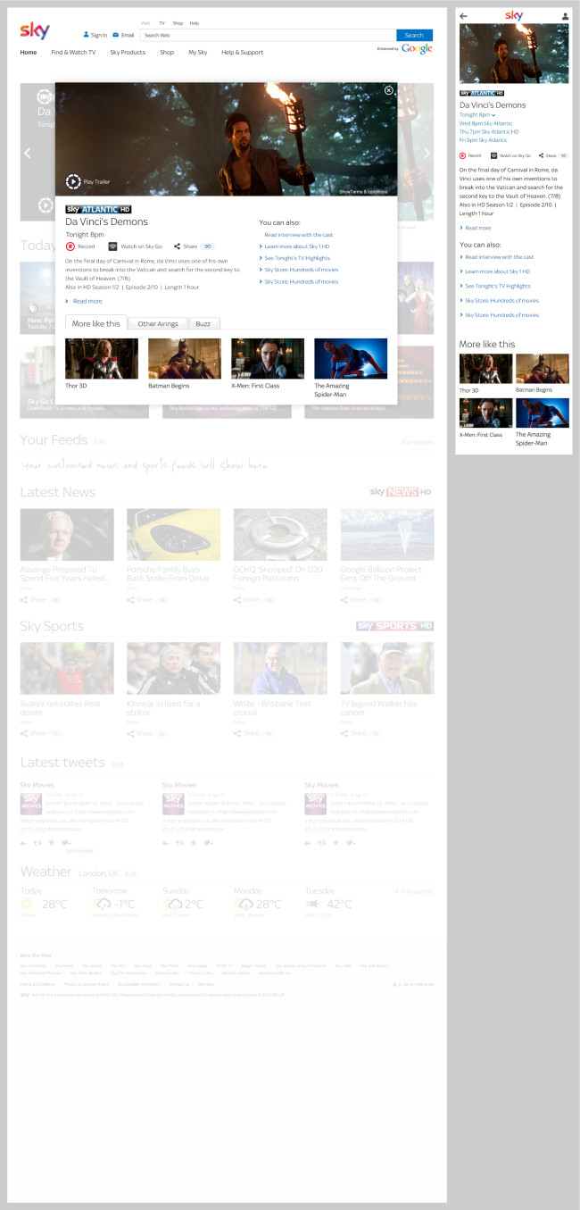
Redesign Sky.com homepage to create a supercool, compelling, brilliantly simple and easy digital experience that truly conveys the brand and the best of Sky.
The homepage must delight our customers whilst supporting our digital objectives: upgrades, retention, content discovery and engagement, account management, help, new sales, ensuring we do so in an accessible, responsive (device agnostic), flexible and efficient way.
Role.
Responsible for designing and Art Directing the Sky.com homepage. This was the first piece that led to redesigning the whole sky.com estate. We immersed ourselves into journey of transformation and consistency. The goal was to make the estate responsive, innovative, engaging and simple. Culminating with a set of guidelines and reusable code patterns, what we call “The tool kit”. This is project that provides continuous improvement, efficiency, allows flexibility, cultivates consistency and affords innovation.
Recommendation.
“Jose is the go-to designer if you want well thought out, smart and beautiful design. He will always deliver work to a high spec, is at the cutting edge of digital thinking and has an attention to detail that is valued by all his peers.
His design skills are as large as his personality, and anyone who knows Jose knows how big a character he is in the team. He is witty, has a charm to get around the toughest stakeholders, and above all is passionate about design making him a truly valued designer in the team and endlessly obsessed in his craft. He is also very caring about mentoring and knowledge sharing – spending time with team members to solve problems and find the best solutions.
I wouldn’t hesitate to recommend Jose to anyone who was considering hiring him, he will become an essential part of any team he joins.”
Kathy Kavan Creative director – via Linkedin

Brainstorming & the book analogy.
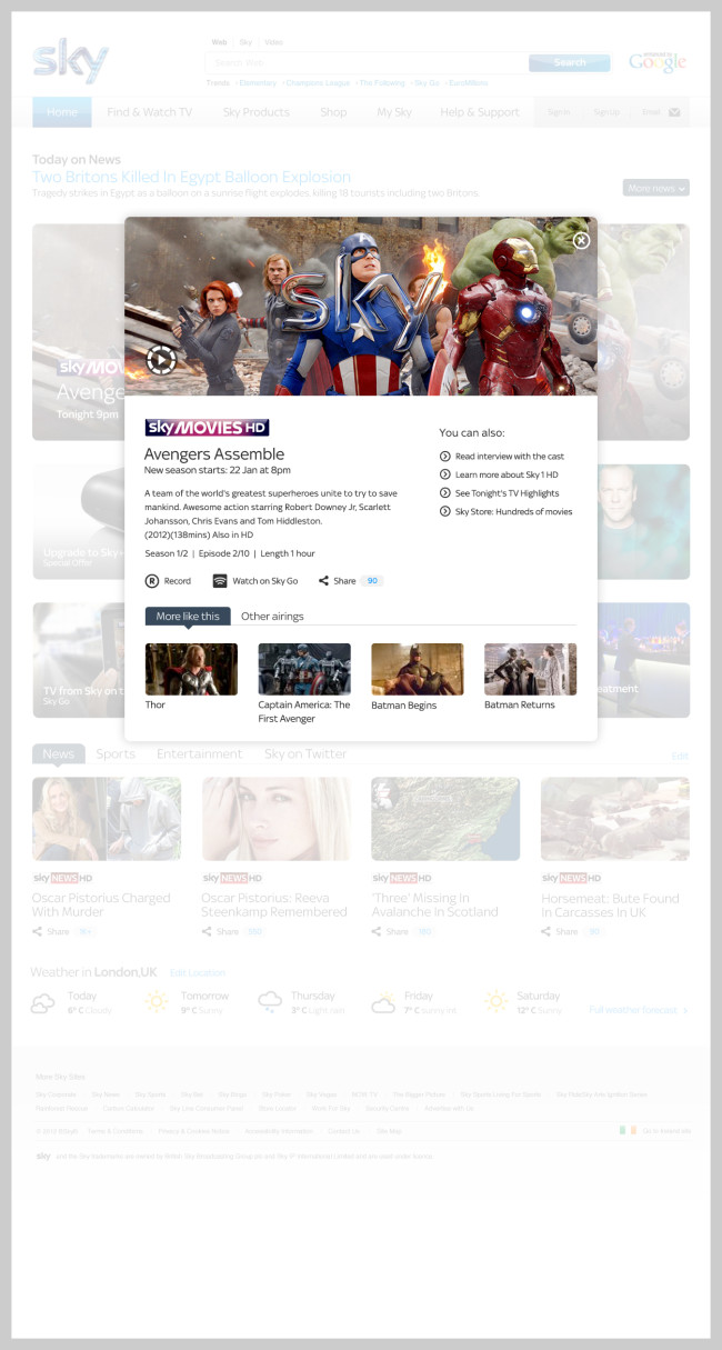
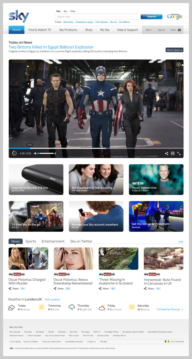
We went into extensive brainstorming for Sky.com. We looked at all the big things that were happening on the web at the time. Browser based and native applications. Flipboard, Pinterest, Amazon, and many others for inpiration. And then we had an epiphany. The book. How do people approach a book? We first see the title on the binder or front cover, then turn it over to read the blurb and then we make the decision to read it or not. So there you have it, with the help of some CSS transitions and or a bit of JavaScript we tried to give to our users that familiar experience on Sky.com Homepage.
